How to Make a Minimalist Logo for Your Company: 7 Steps to Create a Clean and Modern Logo
Are you looking for an exclusive and modern logo? This guide will show you how to create a minimalist logo for your company. By following the steps outlined in this article, you’ll be able to create a logo that is both stylish and functional.
how-to-make-minimalist-logo-for-your-company
The Rise of Simplicity in Branding
Established brands are using minimalism more and more in their logos, choosing simple, clean elements that are easy to remember and work well in any setting. This shift towards simplicity and flat designs isn’t merely a fashion trend, but a necessity born out of the versatile applications of logo designs in our digital age. Brands now have to ensure their logos look equally good on bigger screens as well as smaller ones, making minimalism a preferred choice.
Why Minimalist Logos Matter?
Minimalist logos are more than just contemporary designs; they have significant strategic value as they create a memorable brand image in the consumer’s mind. The simplicity of a minimalist logo not only aids in immediate recognition but also allows for versatile use across various sizes, mediums, and contexts.People today see a lot of complicated images and information. Minimalist logos stand out with their own special charm, having a huge effect on how people see them. Thus, the importance of minimalist logos cannot be overlooked when defining a brand’s visual identity.
Understanding the Basics of Minimalism for Logos
What is a Minimalist Logo?
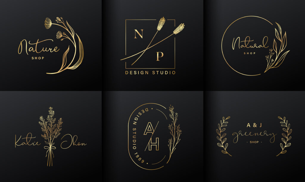
A minimalist logo is a simple design that only uses the most important parts of a brand to get its message across. These logos are characterized by the use of negative space, clean lines, simple shapes, and an understated color palette. They might feature a single symbol, a distinctive typography, or both, but the core elements are kept to a minimum. Rather than overloading the senses, these uncluttered logos capture the central values of a brand in the most effective way. Minimalist logos are highly versatile and can adapt well across different mediums and platforms. They are a graphic distillation of the brand’s message at its most basic level.
Key Elements of a Minimalist Logo
Four main aspects characterize a minimalist logo:
- Image:Unlike conventional logos, minimalist ones strip down the image to its bare lines and shapes. The chosen image represents the brand name or concept in its simplest form.
- Text:Font selection in minimalist logos is precise and devoid of embellishments. Serifs, calligraphic style or extra formation are often avoided in favor of smoother, cleaner lines.
- Color:The use of color in minimalist logos is restrained. For ease of use, many minimalist designs are black and white. Sometimes, only one color is used to stand out from other monochrome brands and get people’s attention.
- Space:An essential element of minimalist design logos is the effective use of white or negative space. It helps to highlight the critical components of the logo and can be used to convey additional brand messages subtly.
In essence, minimalist logos focus on the mantra, “less is more,” maintaining a balance of simplicity, coherence, and sophistication in their design elements.
7 Steps to Create Your Company's Minimalist Logo
1. Start with a Simple Logotype
A great starting point for designing a minimalist logo for your company is to begin with a simple logotype that is clean and uncluttered. A logotype is a logo design that only incorporates the brand’s name, without any additional symbols or graphic elements.
Companies like Google, Uber, Philips, and Disney are great examples of brands that use minimalistic logotypes. To create a minimalistic logotype, focus on the font. The typeface you choose plays an integral role in shaping the mood and tone of your brand. A modern, simple sans-serif font could generate a crisp, contemporary feel, while a classic serif typeface could bring a sense of tradition and reliability.
Remember that simplicity doesn’t mean absence. Your logotype should embody your brand’s essence and communicate its values clearly and efficiently. Keep tweaking until you have a logotype that looks minimal yet meaningful.
2. Utilize Lines and Geometric Shapes
Utilizing lines and geometric shapes is an effective way to create a minimalist logo. Consider incorporating clean, straight lines in your design, which can be used horizontally, vertically, or diagonally to craft an original emblem that looks stylish and modern in any context. Alternatively, irregular lines or squiggles can be used to create more organic, less rigid designs.
For a simple, proportional logo, geometric shapes like triangles, rectangles, circles, squares, and ellipses are great options. Basic geometric figures alone can communicate your brand message, stand for your company values, and set the right mood. They have a natural appeal to the eye, and their use can significantly impact how your target audience perceives your business.
Whether you choose to use straight lines, irregular lines, or geometric shapes, ensure that the final design remains simple and clean, aligning with the minimalist approach.
3. Pick an Appropriate Color Palette
Selecting a suitable color palette is crucial in creating a compelling minimalist logo. Colors can evoke specific emotions and bring a deeper meaning to your logo. They help people understand what your brand is all about.
Brands often choose a black and white color scheme for minimalist design, which draws attention to other parts of the name, like the typeface or geometric shapes. Black and white being neutral colors, easily adapt across various platforms and mediums.
However, if you want to try using brighter colors, make sure that the rest of your design stays simple. One or two colors are usually sufficient. Aim to select contrasting but complementary colors that make your logo pop.
Remember, every color has a psychological impact: blues can convey trustworthiness, red can signify passion and energy, green is often associated with nature and freshness, and so forth. Pick a color that goes with the message you want your brand to send.
4. Choose the Right Typography
The right typography is vital to creating a minimalist logo, even more so for wordmark or lettermark designs. The typeface you choose plays an enormous role in portraying your brand personality, so make it wisely. Think about the visual language you want to communicate.
The sans-serif font is often used in minimalist logos because it gives off a simple, laid-back look. They’re considered less formal than their serif counterparts, perfect for brands wanting to portray an approachable, modern, and forward-thinking image. Some popular sans-serif typefaces used in minimalist logos include Helvetica, Futura, and Arial.
However, some brands may opt for serif or script fonts, especially if they want to convey a sense of sophistication, tradition, or luxury. Brands like Tiffany & Co. or Vogue use serif fonts which are often associated with reliability, respectability, and authority.
Remember, your chosen font should suit your brand and not overpower other logo elements. The best approach is to experiment with different fonts and tweak letterforms, their spacing, color, and size. In this way, you can create a minimalistic typeface that’s customized for your brand.
Ultimately, the goal is to utilize typography that encapsulates your brand’s personality while maintaining minimalistic aesthetics.
5. Opt for a Fitting Layout
The layout of your logo refers to how it is arranged spatially whether vertically, horizontally, or in a circular pattern. A good layout is able to hold all design elements together to form a cohesive look. The key is to ensure a balanced and harmonious composition, despite the simplicity of the design.
If your logo is a combination of text and image, decide if the image should be beside, on top of, or below the text. Each arrangement determines how the logo looks and how easily it’s recognized. Remember, minimalist logo designs thrive on white space to let each element breathe and highlight its importance. Also, the design should be scalable – it should look clear and legible whether you see it on a billboard or a business card.
Whether it’s a geometric form that houses your brand’s initials, a typography design, or a logo composed of several elements, the layout should follow the principles of minimalism. It needs to be simple, uncluttered, and have a focus on negative space. That’s where the true potency of a minimalist logo lies.
6. Customize Your Logo infinitely
Finding a logo design that really fits your brand’s purpose and target group can be hard. Thankfully, in this digital age, there are online logo designing tools that allow you to gain complete creative control over your logo’s design elements.
You can experiment with different choices from a vast library of templates, designed by professional designers. You can make any changes you want, which gives you endless options. From adding icons, customizing colors, changing fonts to editing layouts, you can easily alternate until satisfied.
It’s a liberty unique to online logo-building platforms: capable of creating a one-of-a-kind logo, logo personalization befits the need of businesses looking for a creative yet time-saving and cost-saving solution. By granting users the power to edit infinitely, online logo designing tools offer an edge that manual designing or hiring a professional designer might not have.
Once you’re done customizing, you can download your minimalist logo, accessible instantly with all logo file formats you need. It’s simple, efficient, and perfect for creating a minimal logo that truly feels original and representative of your brand.
7. Preview and Download Your Minimalist Logo
Previewing allows you to visualize your logo under different circumstances and check how your logo may appear in real-world applications. This step is critical as it provides you an opportunity to identify any potential issues with scaling, contrast, legibility, and other critical aspects of your logo.
Most online tools allow you to preview your logo on various mockups such as business cards, letterheads, websites, t-shirts, and more to ensure it looks consistent across different platforms.
Once you’re satisfied with your minimalist logo, the next step is to download it. High resolution is crucial to maintain the logo’s quality and sharpness, especially when printed on various materials.
Downloading your logo files can provide access to multiple formats, including JPG, PNG, PDF, and vector files (SVG, EPS). Vector files are especially important as they allow for resizing of your logo without any loss in quality.
With these options in hand, you’re ready to put your minimalist logo into use!
Tips and Tricks for a Stand-Out Minimalist Logo
Study Various Industries for Inspiration
Gathering inspiration from various industries is a beneficial exercise when embarking on the journey of creating your minimalist logo. Many brands in many fields, including fashion, food, tech, banking, and media, have adopted the minimalist design philosophy, but each has their own way of making their logos stand out.
You can learn from these industries and explore how they’ve captured their brand essence using minimalistic elements. Tesla’s clean-lined T, McDonald’s famous Golden Arches, and Chanel’s simple, interlocked Cs are all excellent examples of minimalist logo designs across different industries.
These successful logos can serve as inspiration for your minimalist design. While it’s important not to copy, observing these logos can provide a valuable understanding of how to merge simplicity and sophistication, creating a design that is clear, concise, and impactful.
Don’t just restrict yourself to your industry; studying broader fields can help cross-pollinate creative ideas and bring a unique touch to your logo. In the realm of minimalist design, inspiration is truly limitless.
Aim for Timeless Over Trendy
While keeping current trends in mind can be helpful, it’s crucial not to let them dictate your minimalist logo design entirely. Trends come and go, but your logo needs to withstand the test of time and maintain its relevance in a rapidly shifting business landscape.
Timeless logos enhance your brand recognition and remain fresh in your customers’ minds for years to come.A great brand design is still useful today and will still be useful in ten years. Think about brands like IBM, Coca-Cola, or Mercedes-Benz. Their minimalist logos have barely changed over the years, allowing them to firmly etch their position in their customers’ minds.
When creating your minimalist logo, aim for a design that aligns with your brand’s mission, values, and target demographics instead of running after the latest trend. The key is to design a logo that can evolve as your business grows, while still holding onto its essential character and core design elements.
Conclusion
Embrace the Power of Simplicity
The world we live in is becoming increasingly complex, making minimalistic designs all the more welcome. Although minimalism’s ethos is simplicity, do not equate it with lack of depth or creativity. Instead, it demands a precise and thoughtful approach to create powerful, effective designs.
A well-thought-out minimalist logo strikes the right balance between being simple and being expressive. It often has more stopping power due to its clean, sleek lines and uncluttered design. A logo reduced down to its minimal bones allows room for the viewer to interact with the company on a personal level; there isn’t a plethora of detail to distract them.
In essence, successful minimalistic logos prove that less is indeed more. They leverage simplicity not as confinement, but as an opportunity for innovation and functional design. By embracing the power of simplicity, you can focus on what truly matters – forging a strong connection with your audience through a uniquely designed emblem.
Take the Leap into Minimalist Logo Design
Stepping into minimalist logo design may seem like a challenging journey, but with careful planning, effective execution, and an understanding of your brand’s core values, this journey can result in a timeless and elegant logo that encapsulates your brand’s vision and ethos to the world.
Minimalist logos compel with their powerful yet pared-back designs. A well-crafted minimalist logo not only enhances your brand’s visual identity but also facilitates stronger brand recognition, enhanced memorability, and impactful storytelling.
Remember, creating an impactful logo is not just about satisfying a visual requirement but also establishing a potent brand connection with your audience. By adhering to the tenets of minimalism in your logo’s layout, you’ll be able to better convey your brand’s values of understated sophistication.
Now is the perfect time for you to take the plunge into minimalist logo design and steer your company along a path of memorable and meaningful visual communication.


